Overview:
The Journey Down
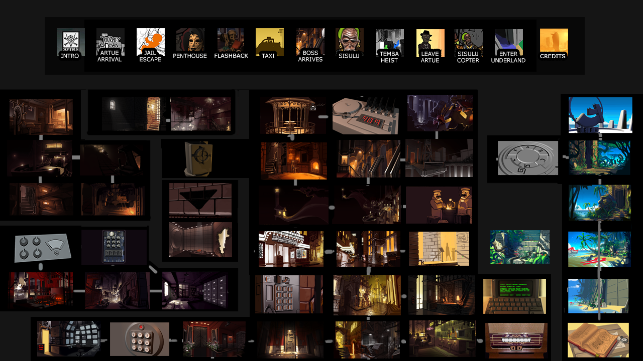
The Journey Down is a story driven point-and-click adventure game divided into to three chapters. To progress, the player navigates around by interacting with the world and objects to take part in the story and solve puzzles. The chapters were released on PC, Mac, Linux, iOS, Playstation, Xbox and Nintendo switch.
My Role:
As the UX/UI designer, Lead Animator and Marketer, I was responsible for a variety of tasks related to creation of characters and interactions with characters and objects in the environment. I was also involved in QA, user testing, marketing strategy and marketing material for a number of storefronts and conferences.
Responsibilities:
User persona, User research, Usability testing, First Click Testing, Findability, Internal testing & iteration, Marketing strategy, Wireframe, Character creation and animation
Challenges for me:
-
- Keeping track of the current player state in the game, what the player had done previously, what was in his inventory what was the next step for the player.
-
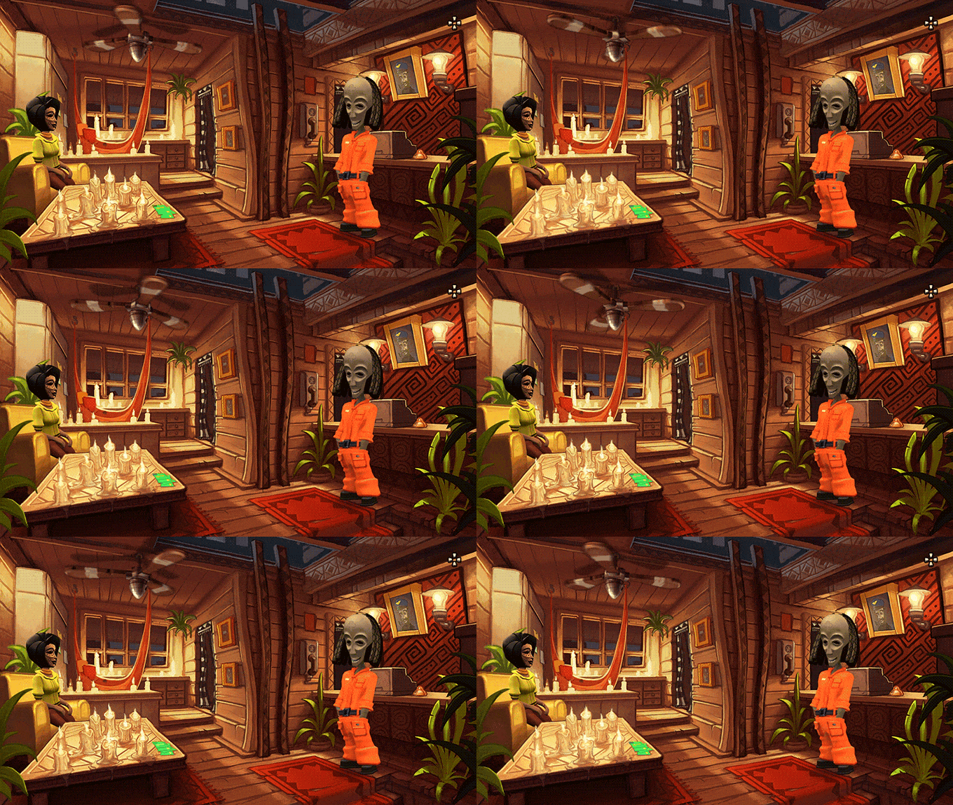
- Placement, design and size of characters and objects in the scene so the player is guided towards the current mission objective. Ensuring that characters, objects and the player is not hidden behind interface or important objects in the scene.
- Graphical assets and animation of characters and objects.
Tools:
Photoshop, Illustrator, After Effects, Premiere Pro, Maya, Subversion.
Design process
Much of the design process was agile with a constant iteration of the design.
Throughout out the years we have tried different ways of working with the design process. In the first chapter, we had more of a loose waterfall approach to the design. Because we had a well designed and tested low res prototype to use as specification for the project. Some parts of the story and puzzle needed to be tweaked and the user flow had to be improved to guide the player better. In the following two chapters we changed to a agile way of working with a team modified version of scrum. We started the design with a story draft, with key locations and expanded the story afterwards. Where we had short iteration between design changes and implementation and testing of the idea.
User research
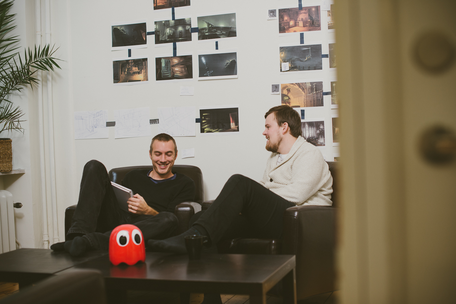
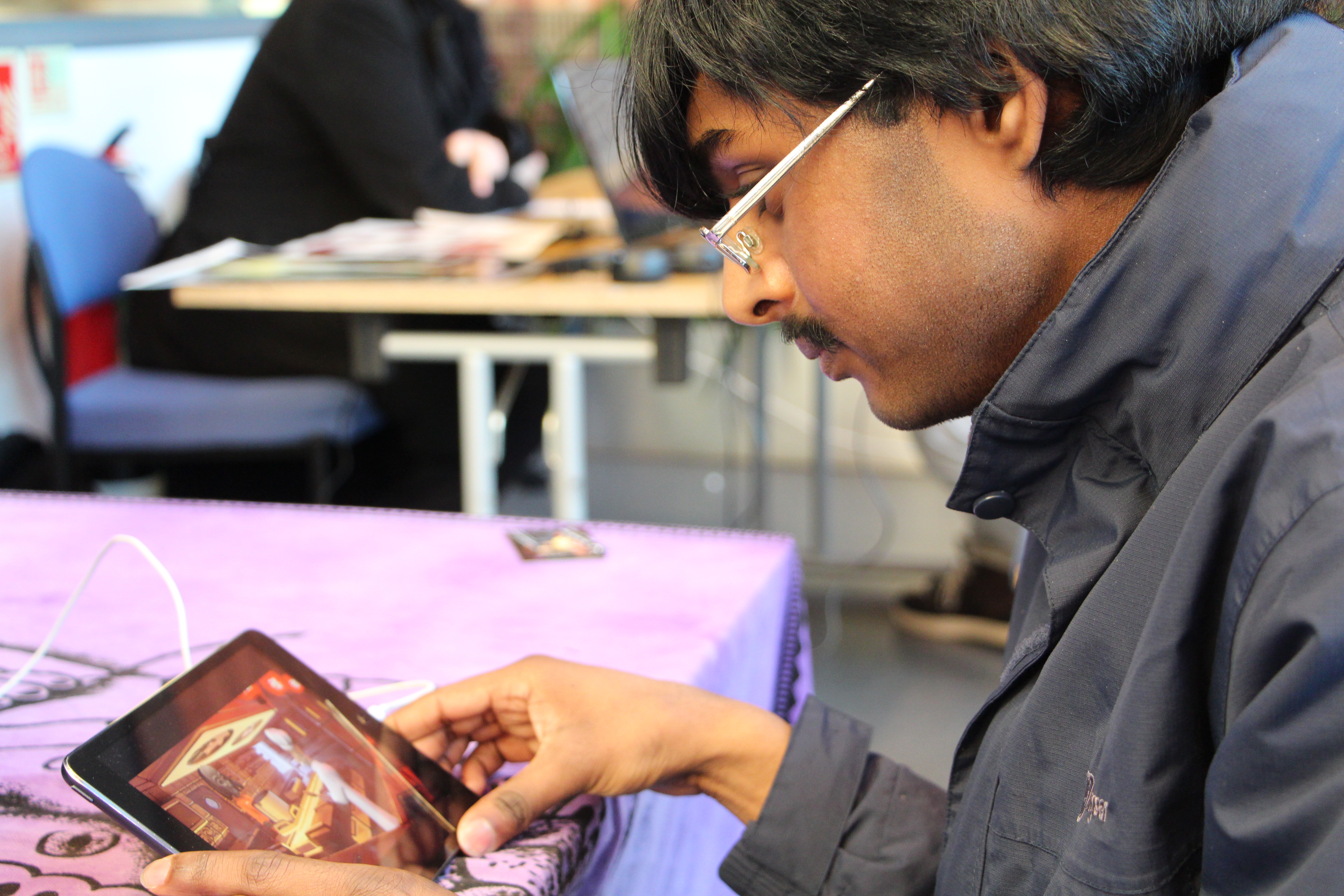
We invited users to our office on friday’s for play test sessions and interviews to get feedback on the latest build.
We have realised that something obvious to us is not always understood or liked by others. So we tried as early as possible to get external input on our ideas. So we didn’t spend to much time designing for our self. We observed reactions and had open conversations about selected parts of the design.
User persona
The company got involved in the adventure game community and visited conferences to learn more about the adventure gamer persona.
We spent farly much time traveling around to meet players around the world to understand who is playing adventure games. We found out that our target audience where 28-45 years old, computer interested, had big nostalgia for the early computer game culture. Many were collectors of old games and objects. Big supporters of keeping the old school adventure game genre alive, but still loved to see new takes on the old games. Many didn’t have time to play games with to long playtime.
Wireframe
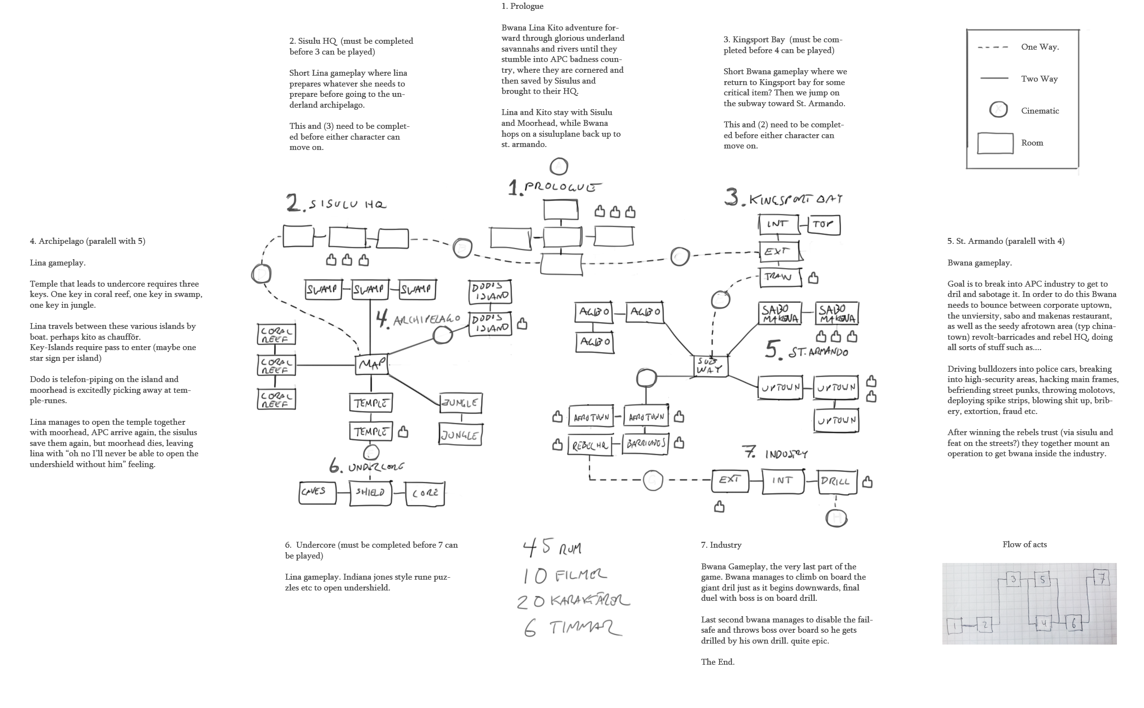
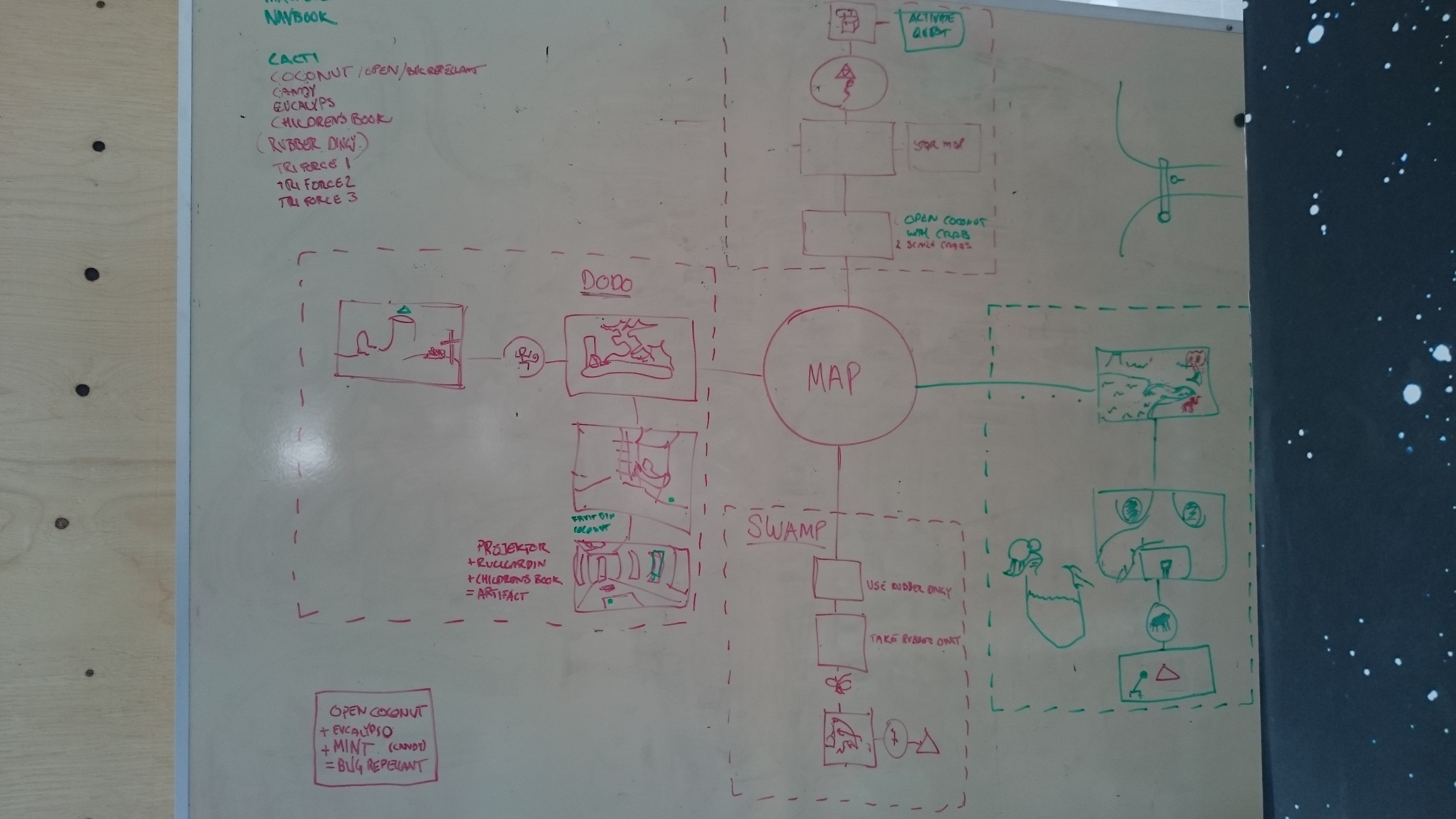
We spent a long time designing the skeletal framework by only making changes to the wireframe.
Instead of having a finished idea and implement it. We selected loose ideas and put it in to our playable interactive wireframe, to figure out how we could connect it to the story and other objects in a meaningful way. We knew that we wanted some characters and object interactions, but not exactly what role they would have in the beginning. When we tested parts of the wireframe, and it felt good, we started to polish that part with real graphics and added voice over. We were probably one third of the project testing and designing the wireframe.
Usability testing
We did extensive usability testing, both on our target audience and users not regularly playing games to make the interactions bulletproof.
- Hallway testing.
Our company was located in the same office building as a bunch of other web and game development companies. So when we needed to test the latest features we could grab a tester who was passing by our office. That made our initial testing of features go a lot faster. - Remote usability testing
When we had a playable version of the game. We made a list of what we wanted to test and sent out the game to various selected people to provide feedback from the comfort of their own home. - Expert review
In a later stages of the production we sent the game to a few design experts in the industry, who have released similar games earlier for feedback.
First Click Testing
To foster a more natural interaction path in the game, we kept track on the order of clicks a user made to solve a problem.
Findability
Did the user find the object they were looking for, if not, where did they look?
During the test we paused the game to ask, for example. ”Where do you think the crowbar is, explain how you would do to find it.” If the majority think it is in a different place than it is. Then we had to consider if we should change the location or path so that it fits better with what the user thinks. In that way we could identify an appropriate path and navigate the user trough the rooms of the game to discover and retrieve relevant information.
Internal testing & iteration
We did internal testing to greenlight every build before involving external testers.
Cross platform adaptation
Adaptation of assets and layouts for Xbox, Playstation and Nintendo Switch.

Kickstarter funding
To fund the development we raised 409,237 SEK from 1,389 backers to help bring The Journey Down, Chapter Three to life.
We have always funded our development by our self. Mainly from sales from previous released games and some consultancy work. Before starting the development of The Journey Down chapter three, we started internal talks about having a kickstarter to raise funds and speed up the development. We did a lot of research and started to build a strategy how we would succeed with the kickstart launch. We identified key factors that needed to be solved to succeed with kickstarters in general.
- First 48 hours of the campaign make the most impact, which, in turn, opens the door for word-of-mouth marketing. And boost your chances of being featured in the kickstarter platform.
- Be strategic about your funding goal. Better to be a successful campaign that gets overfunded than one with an aggressive number that barely meets, or fails to meet the funding goal.
- Have enticing backers rewards, and don’t forget over the top “fanboy” option.
- Have strong video material and shareable kickstarter content for social media.
- Engage with the community. When the people stop backing and the fund progress bar slows down, there is a great chance that the kickstart fails.
We secured a large group of potential backers before launching the kickstarter, by:
- Sponsoring and going to adventure game conferences, to connecting with the community.
- Before the release, backing other kickstarters in the same genre. That later on recommended our kickstarter to there backers.
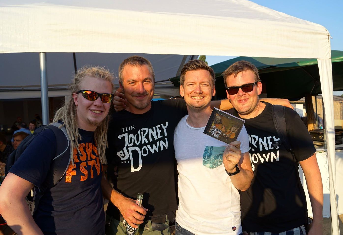
- Talked to friends in the local gaming community, offering SkyGoblin t-shirts to everyone who backed our kickstarter day one.
- Made a list of all who said they would back the kickstarter and manually contacted them when we launched the kickstarter.
- Bought adds at selected target audience webpages.
- Asked what the adventure community wanted to see as backer awards before launching the kickstarter.
- Talked about the kickstarter on social media.
- Sent out press releases to all our press contacts.
- Local event the day we released the kickstarter.
During the kickstarter:
- We had one update every day to keep the backers interested and stay on the page. The event schedule was planned and produced before the release. So we could focus on being social with the community on kickstarter and social media.
- We set a realistic funding goal at the beginning. When that goal was reached after 5 days we presented new goals to fund. In that way we could secure the finding we needed and use the already invested backers to raise it more for bonus features to the game. We asked for 300,000 SEK and ended up with 409,237 SEK.
Conclusion & learning:
Running a kickstarter was fun and challenging. I got a much better understanding of running a campaign. We manage to deliver the game on time and received positive reception. We also got a lot of help with the marketing from the users when we released the game on stores. We were too naive about the time and cost to produce and ship physical awards. So if I would run a Kickstarter in the future i would spend more time on planning the awards and probably focusing more on digital awards. I would also set up a better pipeline to keep contact with the backers so i didn’t have rely on the kickstarter massage form. All in all, it was a fun experience.
Marketing strategy
We had to reinvent our marketing strategy every release because of changes in the industry.
The gaming industry is changing fast. Marketing that worked last year is redundant this year. Influential stores, people and news outlet in the industry are constantly moving around. So we had to become exports on adapting to the changing landscape.
Having a quality product that stands out
Indie scene social media
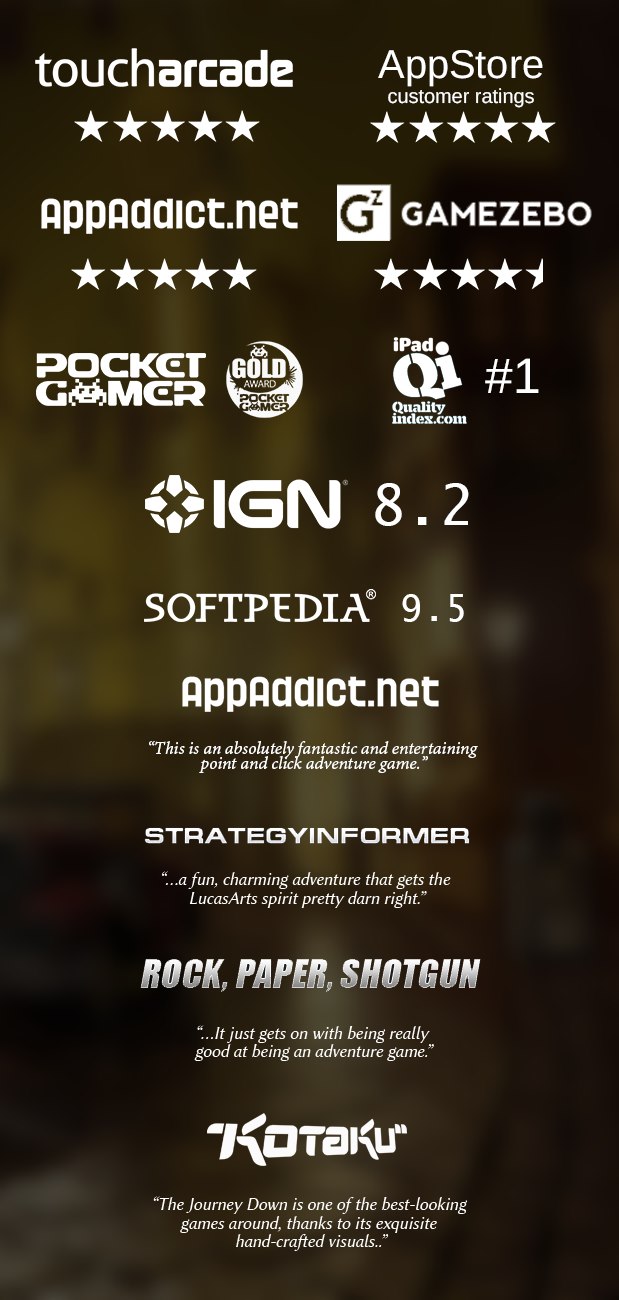
High reviews
Keymailer for review keys signup
Buying ads at few selected web pages
Active in the indie and adventure game scene
Twitter influencers
Influencing platform holders
Sales strategies, having planned sales: chap1 90%, chap2 70%, chap3 50%


